Appbox Rapid Prototype Project
One skill that I particularly love to develop is quickly translating a design into a fully functional web app/page/site. A couple months ago I recreated the Appbox template homepage with 3 friends in 4 days. It is a massive homepage and was no small feat to construct.
This project really focuses on the presentation layer. There are so many components in the UI and lots of different colors, font sizes, and line heights. In order to create the components in such a short amount of time, we created a style guide that I was in charge of.
Style Guide Example
Our team built a single style sheet using Sass. Sass works well with style guides because they translate well into variables, functions, and Sass maps. I had to convince my teammates to try out the power of Sass maps, which they were initally skeptical about but in the end ejoyed their flexibility and organization. Below is a map I made for border colors, notice that they are all based on the four colors of our monochromatic theme.
// MONOCHROMATIC THEME COLOR PALETTE

$theme-colors: (
  primary: #252525,   //Dark Grey
  accent: #05c3f9,    //Sky Blue
  secondary: #383838, //Light Grey
  base: #ffffff,      //White ------ DOCUMENT BACKGROUND
);
// Example Usage: $button-color: color('primary'); // #252525


// BORDER COLORS

$border-colors: (
  'primary': mix(white, map-get($theme-colors, primary), 45.5%),  // PRIMARY (GREY) BUTTON/LINK BORDER & SECTION H1 UNDERLINE
  'accent': mix(black, #05c3f9, 30.1%),   // BORDER FOR ACCENT (BLUE) BUTTON/LINK
  'profile': mix(black, #05c3f9, 11%),    // QUOTES & TEAM MEMBER IMAGE BORDER
  'base': mix(black, #05c3f9, 35%),       // BORDER FOR WHITE BUTTON/LINK
  'input': mix(white, #252525, 39%),      // BOTTOM INPUT FIELD BORDER
  'new': #037fa2
);
// EX: $border-color: border('primary'); // #888888
The mix function in Sass is really great because it allowed me to keep all those border colors in relation to the theme (even though they are quite different). The awesome bonus is how adjustable the theme is: if the main colors change, then the border colors will as well.
Mixins, Placeholders, Tables--Oh my!

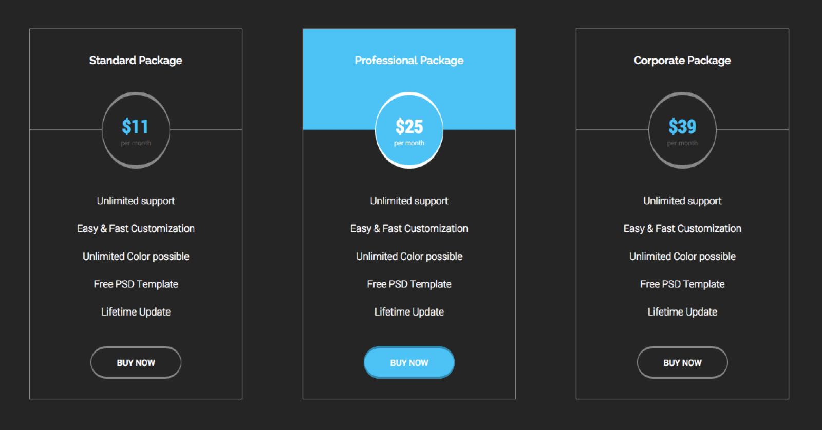
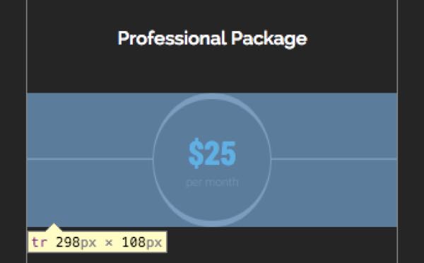
Check out the image above. Do you think these pricing bundle components are <ul> elements or <table> elements? They could easily be both! I chose to view them as <table>s because they appear to have a table-like structure with a header row and the same type of item in each of the sub-rows. But it is much more difficult to style this element as a <table> than an unordered list, especially the change of color on hover and pricing circle component.
Here is how I did it. Because these styles may be reused on subsequent pages, I created a @mixin for the background, font, and border colors:
@mixin background-horiz-line($background-color: color('primary'), $line-color: border('primary')) {
  background-image: linear-gradient($background-color 49%,
                    $line-color 49%,
                    $line-color 50%,
                    $background-color 50%,
                    $background-color 100%);
}

@mixin bundle-theme($font-color, $border-color) {
  color: $font-color;
  border-color: $border-color;
  background-color: transparent;
}

%table {
  font-family: $secondary-font;
  font-size: $font-regular;
  font-weight: $font-weight-l;
  text-align: center;
  border-collapse: collapse;
  border-width: $input-border-width;
  border-style: $input-border-style;
}
Notice that the background is actually a linear-gradient. This is because the pricing circle component is actually a row with a horizontal line through it, created with a background: linear-gradient();.

Also, I really like keeping CSS properties in a pre-defined order so that the team's code is consistent. Notice that ours stayed true to:
positiondisplayfontbackgroundborder
The rest of the bundle styles are here (only 100 lines of Sass), and the styling for layout are here.
Pure CSS Sliding Search Field

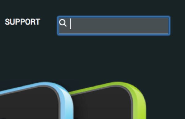
The web page features a search icon in the top right corner. This SVG is actually a background image on an <input> element. On :hover the opacity of the element changes, and on :focus the width and background change to give the element a different style, even though it was already there! Here's the code:
.search-field {

  input {
    padding-bottom: .5em;
    margin-bottom: 0;
    width: 1em;
    font-family: $primary-font;
    font-size: $font-small;
    font-weight: $font-weight-l;
    text-transform: uppercase;
    background: url('/img/search.svg') no-repeat;
    background-position: left .2em;
    background-size: 1em;
    border: none;
    -webkit-appearance: none;
    @include transition(all .3s ease-in);
    &:hover {
      opacity: .5;
      cursor: pointer;
    }
  }

  input:focus {
    width: 40%;
    margin-left: 10%;
    padding-left: 1em;
    background-color: rgba(255,255,255,.2);
    border-bottom: 1px solid border(primary);
    &:hover {
      opacity: 1;
    }
    @media screen and (min-width: $break) {
      width: 14em;
    }
  }
}
There are a lot more elements that I contributed code to for this project. Here is a list of some more to check out (with links to the codes on GitHub).