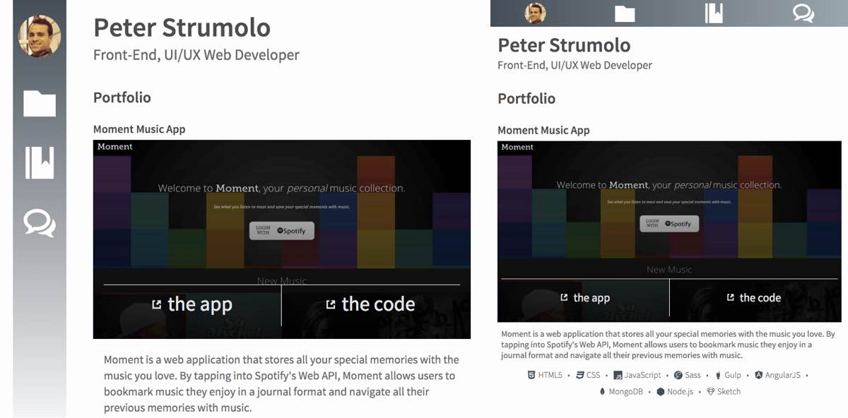
Portfolio Highlights
This website is small and light. After all, it is simply a blog and a place to highlight my code and list contact information. There are some really cool aspects of it though. First, for the design, I knew I wanted to have a blog/journal like feel with navigation on the left. Many apps are implementing this sort of design. But it doesn't look so hot on smaller screens, so I decided to move the navigation to the top when on a small mobile device.

The layout for the header component (which includes the navigation) is interesting since the header is the first section on my HTML but needs to be appear outside of the flow of the document in style. For this I used fixed positioning for larger screens and absolute for smaller ones. Here is the layout code:
header {
  @extend %margin-wrapper;
  display: flex;
  justify-content: space-between;
  .header-logo {
    @extend %content-padding;
    display: inline-block;
    order: 2;
    padding-top: $base-line-height * 3;
    padding-bottom: $base-line-height;
    @media screen and (min-width: $break) and (min-height: 500px) {
      padding-top: $base-line-height;
    }
  }
  .top-navigation {
    position: absolute;
    order: 1;
    width: 100%;
    z-index: 8;
    ul {
      display: flex;
      justify-content: space-around;
      text-align: center;
    }
    img {
      max-width: 100%;
      max-height: 100%;
    }
    a {
      display: inline-block;
      height: 100%;
    }
    button {
      height: 100%;
      padding-top: 2px;
    }
    svg {
      height: 100%;
      width: 100%;
    }
    li {
      display: inline-block;
      padding: .4rem 0;
      height: $base-line-height * 2.2;
      max-width: $base-line-height * 2;
      &:first-child {
        padding: .3rem 0 .2rem;
      }
    }
    @media screen and (min-width: $break) and (min-height: 500px) {
      position: fixed;
      display: inline-block;
      width: auto;
      height: 100%;
      padding: 0 $base-line-height / 2;
      ul {
        display: block;
      }
      svg {
        max-width: $base-line-height * 3;
        height: $base-line-height * 3;
        padding-top: 0;
      }
      li {
        display: list-item;
        margin: $base-line-height * 1.65 0;
        height: $base-line-height * 4;
        max-width: $base-line-height * 4;
      }
      li:first-child {
        height: $base-line-height * 5;
        margin-top: $base-line-height * 1.25;
      }
    }
  }
}
I also wanted to spend more time on SVG implementation. Since my images are for site navigation and icons to social profiles, I decided to go with inline SVGs. I explain more in a blog post.
On a couple occasions I use a modal component to display images. For this I just used plain CSS, no JavaScript. Here is the layout and styling:
Layout
.img-modal {
  display: none;
  &:target {
    display: flex;
    align-items: center;
    flex-direction: column;
    justify-content: center;
    position: fixed;
    top: 0;
    right: 0;
    bottom: 0;
    left: 0;
    padding: $base-line-height;
    z-index: 10;
    img {
      margin: 0 auto;
      max-height: 100%;
    }
    figcaption {
      margin-top: $base-line-height;
    }
  }
}
Styling
.img-modal {
  &:target {
    background-color: rgba(0,0,0,.8);
    figcaption {
      a {
        @extend %button;
        &:hover {
          background-color: color(secondary);
          transition: .2s ease-in;
        }
      }
    }
  }
}
To get to this page, you probably clicked a link called "the code" that is overlayed on an image of the project. This was done by using absolute positioning for the <figcaption>, which means the <figure> element has relative positioning.
.portfolio-item {
  padding-bottom: $base-line-height * 2;
  padding-top: $base-line-height;
  figure {
    position: relative;
    max-width: 100%;
  }
  figcaption {
    position: absolute;
    top: 0;
    right: 0;
    bottom: 4px;
    width: 100%;
  }
  .project-links {
    position: absolute;
    bottom: 4px;
    width: 100%;
    display: flex;
    justify-content: space-between;
    padding: $base-line-height / 3;
    text-align: center;
...
  }
}
There is more code to explore from this site on GitHub.